

Home Doc Display Settings Adding Custom Buttons in Simple Social Buttons
The Custom Buttons feature lets you add one or more fully customized buttons to your social bar. Unlike the standard platform buttons, custom buttons are not tied to a specific social network.
You can define the label, destination URL, icon, and color scheme, making them ideal for driving traffic to a landing page, affiliate link, sign-up form, or any other destination that matters to your business.
This feature is now available in Simple Social Buttons Pro.
To find the Custom Buttons area, open your WordPress dashboard, navigate to Social Buttons, then Settings.

Scroll down the settings page until you reach the Custom Buttons section. You will see a panel containing all the fields needed to configure your button, along with the management actions for any buttons you have already created.
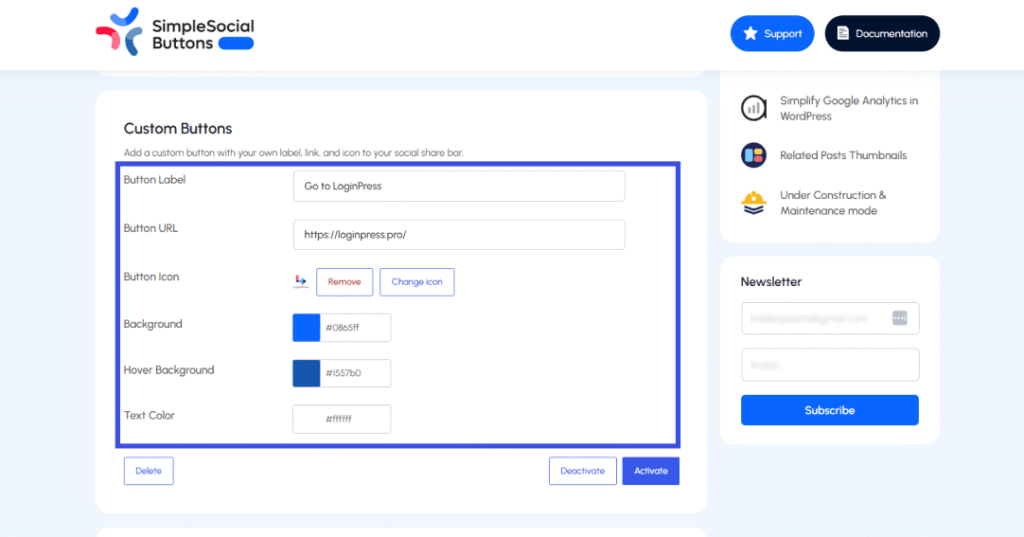
Each custom button is built from seven fields. Fill them in as follows:
Enter the text that will appear on the face of the button. This is what your visitors will read, so keep it short and action-oriented. Good examples include “Visit Store,” “Download Guide,” “Get the Deal,” and “Join Our List.” The label can be anything that fits your call to action.
Enter the full web address you want the button to open when a visitor clicks it. This can be an internal page on your site or any external URL, a product page, a campaign landing page, a partner site, or a sign-up form. Always use the complete URL beginning with https:// to ensure the link works correctly and securely.
Click the Upload Icon to open the WordPress Media Library. You can select an image you have already uploaded or add a new one from your computer. For the best results, use a simple, square image. Icons that are too detailed or too wide can look cluttered at the small sizes used in social bars. A clean, single-color symbol or logo mark tends to work well.
Choose the default background color for your button; this is what visitors see before they hover over it. Enter a hex code directly, for example #0865FF for a strong blue, or use the color picker if your interface provides one. This color should fit your brand and stand out enough to attract attention in the social bar.
Choose the color that appears when a visitor moves their mouse over the button. Using a slightly darker or lighter version of your main background color is the most common and effective approach. The visual shift signals interactivity and confirms to the visitor that the button is clickable.
Set the label text color on your button. White (#FFFFFF) works well on most colored backgrounds, but the key requirement is contrast: the text must be readable against whatever background color you have chosen. If you are unsure, tools like the WebAIM Contrast Checker can help you verify accessibility.
Once you have filled in all the fields, scroll to the bottom of the settings page and click Save Changes. This stores your button configuration. Saving alone, however, does not make the button visible on your site.
To make the button live, click the Activate button next to your custom button in the Custom Buttons panel.
Until you activate it, the button will appear in your settings but not in your social bar.
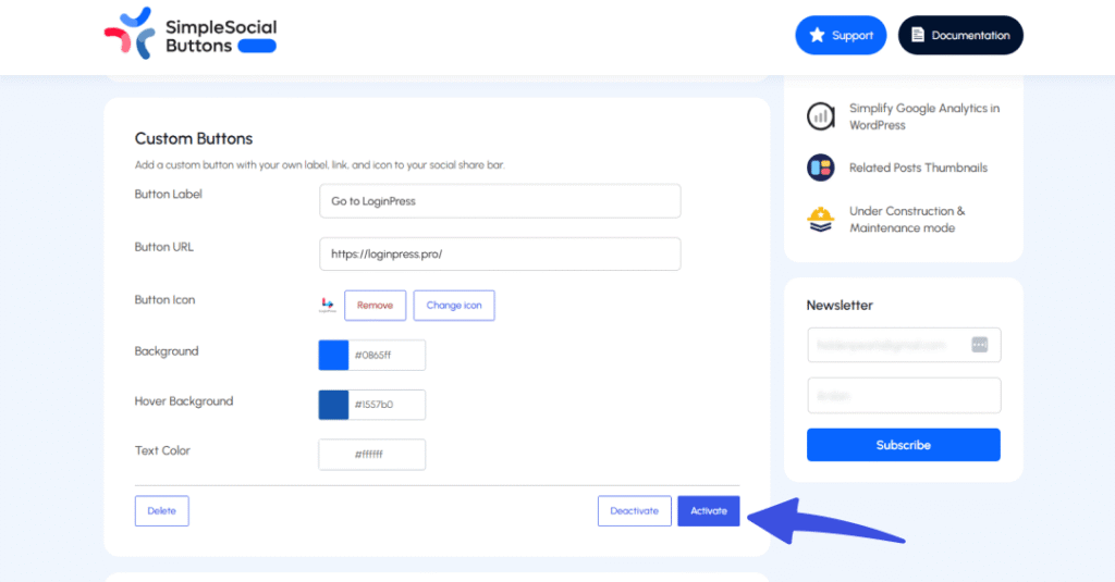
Note: Think of it as a two-step process: Save stores the configuration, and Activate makes it visible to visitors.
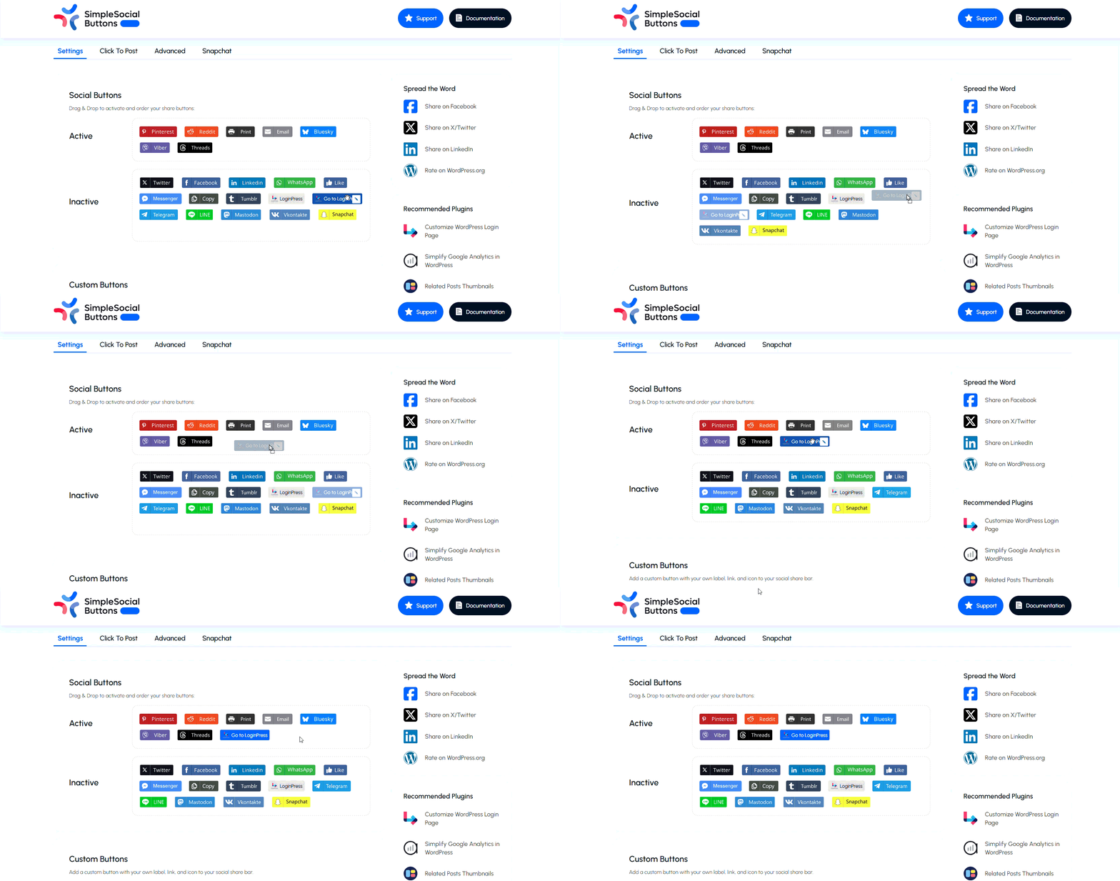
After activating, you can position the custom button alongside your other social network buttons in the main Social Buttons list. Drag it to the position you want within the active buttons list, and it will appear in that order across all your configured placements.
At the bottom of the Custom Buttons panel, you will find three management actions for each button you have configured:
| Action | What it does |
|---|---|
| Activate | Enables the custom button and makes it visible with your active social buttons on the front end of your site. |
| Deactivate | Temporarily hides the button without removing its configuration. All your settings are preserved, so you can switch them back on at any time. |
| Delete | Permanently removes the custom button and all of its settings. This action cannot be undone, so use it only when you are certain you no longer need the button. |
You can create multiple custom buttons and manage them independently. Each button has its own activate, deactivate, and delete controls, so you can run several custom CTAs at once or stage buttons for future campaigns without affecting the ones that are currently live.
A few practical suggestions to get the most out of this feature:
Custom button icons are uploaded through the standard WordPress Media Library, so the same file type rules apply; JPEG, PNG, GIF, and SVG files are generally supported, depending on your WordPress configuration
Tip: For best results, use a square PNG or SVG with a transparent background, kept under 100KB. Simple, single-color icons tend to look the cleanest at the small sizes used in a social bar.
Yes. You can create multiple custom buttons and manage each one independently. Every button has its own label, URL, icon, color settings, and activate/deactivate controls, so you can run several at the same time or prepare buttons for upcoming campaigns without affecting the ones that are already live.
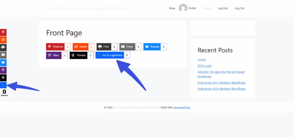
Your custom button follows the same placement rules as your other social buttons. Once activated, it appears wherever you have configured Simple Social Buttons to display, whether that is on posts, pages, or both. If you want to limit where it shows, adjust your placement settings under Social Buttons >> Settings.
Note: Deactivating a button hides it from the front end of your site but does not delete any of its configuration. The label, URL, icon, and color settings are all preserved exactly as you left them. You can reactivate it at any time, and it will return exactly as configured, with no need to set it up again.
If you run into any issues setting up your custom buttons, our support team is here to help. Visit our support or check our documentation for additional guidance.